Imagine this: You’ve spent months pinning dream interiors—warm yet modern, cozy yet sophisticated. But every paint chip you try feels too cold, too yellow, or too bland. Then you discover Accessible Beige. Suddenly, your room feels like you again—balanced, inviting, and effortlessly stylish. This isn’t magic; it’s Sherwin-Williams’ secret weapon for timeless design.
Why Accessible Beige Isn’t “Just Another Beige”
Accessible Beige (SW 7036) is the ultimate shape-shifter. With an LRV (Light Reflectance Value) of 58, it lives in the Goldilocks zone of paint colors—bright enough to open up spaces but deep enough to add dimension. Unlike stark whites or flat grays, it’s a warm greige that subtly blends beige’s comfort with gray’s modernity.
But here’s what designers won’t tell you: its genius lies in its undertones. In north-facing light, it whispers a hint of green. Under afternoon sun, it glows with soft taupe. This chameleon quality lets it adapt to:
- Changing light (no more “morning vs. evening” identity crises)
- Mixed materials (from oak floors to marble counters)
- Evolving decor (swap your accent pillows without repainting)
Where Accessible Beige Shines: Room-by-Room Guide
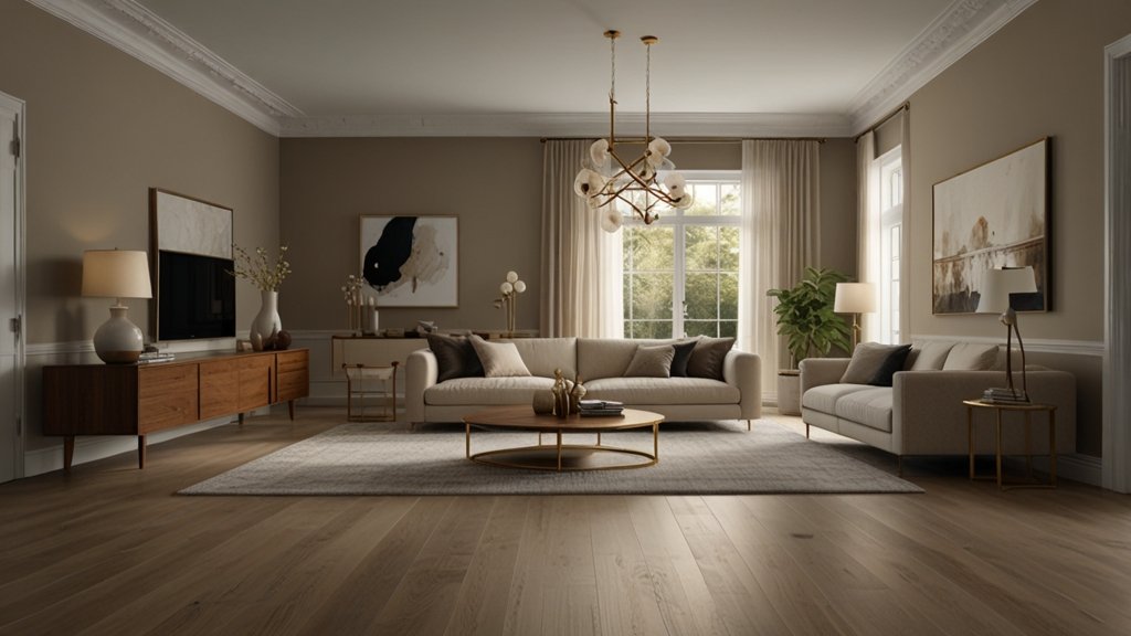
🛋️ Living Rooms: The Unifier
In open-concept spaces, Accessible Beige creates cohesion. Pair it with:
- Crisp white trim (try SW Pure White)
- Textured fabrics (linen sofas, wool rugs)
- Warm metals (brushed brass or aged bronze)
Pro Tip: Bookcases painted Accessible Beige make shelves feel built-in, not bulky.
🍳 Kitchens: The Quiet Backdrop
For cabinets or walls, it lets countertops and hardware pop. Love dark countertops? Accessible Beige prevents a cave-like feel. Prefer all-white? It adds warmth without yellowing.
Material Pairings That Sing:
| Element | Winning Combo |
|---|---|
| Countertops | Carrara marble, soapstone, quartz |
| Flooring | White oak, terracotta tiles |
| Hardware | Matte black, unlacquered brass |
🛏️ Bedrooms: The Serenity Generator
Its gentle warmth promotes calm. Layer with:
- Deeper neutrals (SW Urbane Bronze accent wall)
- Earthy accents (sage green bedding, terracotta throws)
- Soft lighting (paper lanterns, dimmable sconces)
The Lighting Test: No More Color Regrets
Light dramatically shifts Accessible Beige. Here’s your cheat sheet:
| Light Direction | How It Behaves | Design Fix |
|---|---|---|
| North-Facing | Cooler, gray-green undertones | Add warm wood tones & incandescent bulbs |
| South-Facing | Warmer, beige emerges | Balance with crisp white trim |
| Low Light | Soft, enveloping neutral | Use reflective surfaces (mirrors, glass) |
Real Talk: Paint a 4’x4’ sample on foam board. Move it around the room for 48 hours. Watch it transform—you’ll avoid costly regrets.
Accessible Beige vs. The Neutrals Hall of Fame
How does it stack up against fan favorites?
| Color | LRV | Undertones | Best For | Vs. Accessible Beige |
|---|---|---|---|---|
| Agreeable Gray | 60 | Subtle lavender | Cool, modern spaces | Warmer, less sterile |
| Repose Gray | 58 | Blue-violet | Minimalist lofts | More organic, less clinical |
| Balanced Beige | 46 | Golden brown | Traditional libraries | Lighter, less yellow |
| Accessible Beige | 58 | Green/taupe (adaptive) | Any style, any room | The versatile middle ground |
5 Designer Hacks for Maximum Impact
- Ceiling Magic: Skip “ceiling white.” Accessible Beige overhead unifies rooms with tall walls.
- Exterior Elegance: Pair with charcoal shutters (SW Iron Ore) and a crimson door for instant curb appeal.
- Trim Twist: Use semi-gloss Accessible Beige on trim for a tonal (not matchy) look.
- Furniture Flip: Paint thrifted wood pieces Accessible Beige—suddenly they look “custom.”
- Accent Amplifier: It makes jewel tones (emerald, navy) glow but tames neon brights.
FAQs:
Q: Does Accessible Beige look dated in 2024?
A: Absolutely not. Its greige base avoids the “90s builder beige” trap. It’s warmer than cool grays but fresher than yellow beiges—making it timeless.
Q: What’s the best white trim color with it?
A: SW Pure White (SW 7005) for crisp contrast. SW Alabaster (SW 7008) for softer harmony.
Q: Can it work in a dark, windowless bathroom?
A: Yes! Its LRV of 58 reflects light well. Add warm LED bulbs (2700K) to prevent gray cast.
Q: What’s the closest Benjamin Moore match?
A: Edgecomb Gray (HC-173) is similar but lighter (LRV 63). For depth, try Classic Gray (OC-23).
Q: Does it clash with oak wood floors?
A: Surprisingly, no. It neutralizes orange undertones in oak. For cherry woods, test first—red tones may pull green.
Q: What’s the ideal sheen for walls?
A: Eggshell. It hides imperfections and feels velvety. Use satin in kitchens/baths.
Q: Can I use it on kitchen cabinets?
A: Yes! Pair with brass pulls and quartz countertops. Avoid if cabinets get direct sunlight (may emphasize green).
The Takeaway: Why This “Boring” Beige Wins Awards
Accessible Beige isn’t just safe—it’s smart. It’s the neutral that plays wingman to your bold art, your vintage rug, your heirloom dining table. It doesn’t shout; it supports. And in a world of fleeting trends, that’s revolutionary.
So grab a sample pot. Paint that test board. Watch how it transforms at dawn, at noon, under lamplight. You’re not just choosing a color—you’re choosing flexibility, warmth, and a backdrop that lets your story shine.
YOU MAY ALSO LIKE: Shop Spring Vase: To Brighten Your Spring